Planning
Good research into similar texts. Some research into audience, but graphs would have helped. Some good use of drafts.
16/20
Construction
Proficient use of software to construct pages. Good manipulation of images and text. Good explanation of construction process. More photos on the contents page would have helped.
48/60
Evaluation
Some attempt to address the seven set questions. Some attempt at critical analysis. Lacks detail and insight in places but generally good.
14/20
Overall
78/100 B
Sunday, October 18, 2009
Saturday, October 10, 2009
Evaluating
So now I need to evaluate the whole thing
I'll bullet point them off according to Mr. Winn's pointers
Parents and peers commented that the product did indeed feel that it was aimed at me target demographic, specifically the use of such basic, yet serif and formal text. They also believed that the use of a common symbol of the College, the CCF, made a good subject for the cover and the composition and body language of the student made the product appear to be very formal.
I'll bullet point them off according to Mr. Winn's pointers
- My finished product uses the recurring theme of a single main image, in this instance a single pupil stood outside the College, it challenges the normal idea of having the masthead and tagline together and the positioning of these and the dateline
- The product represents and targets an ABC1, more specifically A/B socio-economic group. From a more specific perspective it represents the parents of students at the College. It does this by using a variety of imagery, all heavily associated with the college and relatively formal text and layout, with no jaunty angles
- The main institution for distribution for the product would be the school itself as it is the only place where it's demographic would look for it
- The product has a niche audience of parents of students, and potentially teachers, ABC1 socio-economic group, fairly upper class, aged from 30 up but generally at those 40 and over
- I aimed the product at these audience by using ideas which were intertextual as representative of print publications for such an audience. Examples of this were ver basic, serif text, a very basic colour scheme, all images kept at very perpendicular angles, nothing curved or appearing to be less than horizontal or vertical.
- From the production of this cover i have learnt that image manipulation software is very clever, versatile and complex.
Parents and peers commented that the product did indeed feel that it was aimed at me target demographic, specifically the use of such basic, yet serif and formal text. They also believed that the use of a common symbol of the College, the CCF, made a good subject for the cover and the composition and body language of the student made the product appear to be very formal.


Actually doing it
Right, research is done, planning is done. Now the fun bit comes, doing it.
I'll be using Adobe Photoshop CS2 on a mix of Windows and Mac for the cover and InDesign for the contents page
Evidently more time will need to be spent on Photoshop doing image manipulation for the cover and the background image of the contents page, so a good 6 hours will be spent making everything look as I want it to. I also aim to spend about 1 hour on InDesign actually putting the image(s) in and inputting all the text
The images I'll be using have all come from original photography by myself taken on a digital camera and then uploaded to a computer. The college crest will be a stock image from Mr. Winn

 As you can see there are the three images I used, all original photographs apart from the College crest
To actually put it togehter:


I'll be using Adobe Photoshop CS2 on a mix of Windows and Mac for the cover and InDesign for the contents page
Evidently more time will need to be spent on Photoshop doing image manipulation for the cover and the background image of the contents page, so a good 6 hours will be spent making everything look as I want it to. I also aim to spend about 1 hour on InDesign actually putting the image(s) in and inputting all the text
The images I'll be using have all come from original photography by myself taken on a digital camera and then uploaded to a computer. The college crest will be a stock image from Mr. Winn
 As you can see there are the three images I used, all original photographs apart from the College crest
To actually put it togehter:
- I created a new A4 size Photoshop doument
- Opened the image of the College and cropped it down to just the main door
- Added the cropped main door to the blank A4 document and transfromed it to the correct size
- Used the Magnetic Lassoo Tool to cut out the image of the student in uniform
- Copied and pasted the student into the main document and placed him in the designated position
- Finally, copied in the College crest, pre-cropped
- I then added all the various texts over these


The planning stage
So now I know what's popular and what works well in front covers and have looked at some existing examples I'm ready to start thinking about actually doing it. Befor I jumped straight into photoshop I threw some ideas together in the form of really basic paint made pictures which I'll upload and annotate

- The grey are will be where I will put an image of the college crest

- The red are is where I will place my shot of a student, in CCF uniform, in medium close-up
- The green area is where I will place my masthead, it may be different but I think if done correctly it will work well
- The blue area will be my tagline and dateline area, theres will be put together as I think with such a vague date being used the two together will compliment each toehr well
- As a background image I will use a picture of the College itself, possibly cropped down to the main doors


 The red area will be where the title 'Contents' will go
- The 2 blue areas represent the two main columns for text
- As a background I will use a very transparent, sepia image of the college
Tuesday, September 15, 2009
Target Audiences
So the next stage is target audiences for the magazine. if I know who's going to read it I'll have a better idea on how I should structure it. Also various other personal thougths could be useful, so a questionnaire seems like a sensible option. I chose to ask the following things
1.Age (tickbox of groups)
2.Student/parent/other
3.Currently read magazine?
4.Personal choice of cover image
5.Features liked
6.Features disliked
7.Most important things for cover to include
8.Preferred colour scheme
9.Preferred font style
From these questions I found that:
- Most readers were middle aged (30-50)
- Around 4/5 were parents
- That only around half actually currently read the magazine
- Sport and CCF are popular cover images whereas academics are not
- The celebration of students seems to be well liked, as does the mix of focus on sport, CCF and academics equally
- The amount of celebration on the staff and awards the school has achieved seem more unpopular, so shoudl be less emphasised
- The conscensus was that the cover should include a mix of sports, CCF and the College itself, these were the three main popular ideas in the feedback
- A colour scheme involving the school colours was the most popular choice
- Very elegant, serif fonts were cited as the most liked
Wednesday, September 9, 2009
It begins, I'm gonna start by looking at magazine covers to identify what we need to be looking for, so I shall insert the pictograms and deconstruct them


Now I'm not persoanlly interested in Cosmopolitan, but I stole this image from google and it covers naming all the relevant parts to a front cover, so seems a good guideline, and I can use it to see what is popularly done, now for something I'm more interested in before I look into possible trends


Right, now to look into likenesses and how it reflects the demographic
With school magazines being the focus of the task I decided to find some more topical ones to look at such as these :
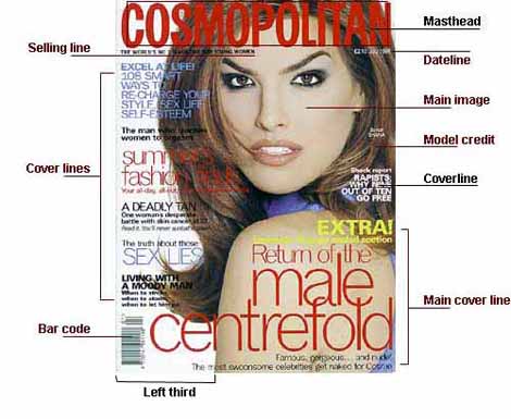
Now I'm not persoanlly interested in Cosmopolitan, but I stole this image from google and it covers naming all the relevant parts to a front cover, so seems a good guideline, and I can use it to see what is popularly done, now for something I'm more interested in before I look into possible trends


Right, now to look into likenesses and how it reflects the demographic
- A single main image is used each time
- As well as the masthead there seems to be one or more main articles which are covered by a cover line and a smaller piece of information related to it
- Spreading the rest of the information around also seems to be popular
- Cosmopolitan has much more language on it than the other two, reflecting the target demographic well, the Cosmopolitan targetting intelligent women whereas the other two to attract everyday people interested in music/gaming respectively
With school magazines being the focus of the task I decided to find some more topical ones to look at such as these :

The single main image idea seems popular here as well
- The masthead is consistent and prominent
- A single tagline is used both times
- The images represent different ideas, both of which are important

Subscribe to:
Comments (Atom)